Friday, December 2, 2011

Top 10 Cocktail Ottomans


As chosen by moi, Jaime Rogers.

While researching a current project,  I decided to create a file of my favorite pieces found...albeit not all appropriate for the aforementioned job.  Nevertheless, what better way than the blog to collect personal favorites as well as create a visual journal of the people, places and projects that I find interesting and frequently serve as inspiration?  It's a winning move, even if I'm the only one to reference it;)  The blog is coming back.


Recently, I was asked to post my Top 10's, so here is the first of many installments. All the pieces included are in line production pieces, meaning if you like for yourself, you can actually get your hands on it.  I'm a big believer in buying the best you can. As long as the scale and proportion are well executed, one finds good usually goes with good.  Remember, a few well selected pieces go a long way in building the credibility of a space, never mind that you can usually use them for decades, if not a lifetime.

If you have personal favorites, please feel free to reference them in the comment section.  I'd love to know!


Now onto the top 10, in no particular order:
(obligatory drum roll) 


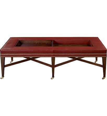
 1911 Cocktail Ottoman, Hickory Chair


I've used this piece in a previous project; great style, pragmatic and versatile.  What's not to like?


Sumptuous as it is as shown, I could easily see this one in linen with a graphic tape along the bottom. Love it.


I'm actually using this piece in a current project...more on that later.


I'd love to see a graphic pattern or suzani on this piece!


Peyton Ottoman, Ralph Lauren


Again, if you have favorites you would like us to know about, do tell.


Sunday, July 4, 2010

Icons of Red, White and Blue

In celebration of the Fourth of July, DOXA is recognizing our favorite designers who have created many beautiful, classic American interiors employing each of these colors.  Drum roll please...

RED 


WHITE


AND BLUE


T Keller Donovan


Thanks for coming along for the ride, hope you enjoyed their work as much as we do!  For more goodies in the our patriotic palette, please visit the links below:

RED
WHITE
BLUE


Till next time.......


Monday, June 14, 2010

Celebrating our 101st Post with Mary Douglas Drysdale!!!


Mary Douglas Drysdale is a modern day icon in the world of traditional design, in 2009 Ms Drysdale was nominated for a lifetime achievement award of excellence at the Cooper Hewitt Design Museum (my most favorite museum!).  While her work is exceedingly diverse it is clearly rooted in classicism, always fresh, relevant and maintains a certain modern awareness about it. My discovery of her work upon my entry into interior design left an indelible impression on my personal aesthetic and preferences.  I am beyond excited and flattered that she has agreed to do an interview with yours truly and have been gushing for the past six weeks!  Finally...it is here;)  What a wonderful way to mark our 101st post!  Many, many thanks to Ms Drysdale for being so incredibly open and gracious! 


I adore this photo of Mary, it so captures her spunky spirit!  Below are her words as to how she came about building this vignette:


"When most people think about my work, they think about the color and the sassy part. I spend the most time thinking about the precision, the foundation. It’s clean, it’s calming, and it’s strong so I can lay on top of it, something that’s sassy and unexpected.


In approaching this vignette, I was immediately drawn to Daniel Pohl’s “Buffet” because it’s so jewel-like and full of texture. There’s a playful quality that creates a dynamic tension between weight and lightness of spirit.


In my role as a designer, I’m trying to be responsive to an object and select pieces that share those qualities. By using the same colors above the Pohl as is in the buffet itself, but brightened, the pieces all connect. They’re like pieces of jewelry on an artfully designed armature. Because the colors of the Van Bankston painting are similar to those in the buffet, each piece can be seen in a different way.


I also like the square of the painting on top of the rectangle of the buffet. For me, there’s a classical foundation there that’s interesting. There’s a relationship of objects: what’s happening on top of the cabinet and how it relates to the base. There’s a connection between every element on that console that draws you in. I think there’s something about creating relationships that are below the radar screen because it gets people to stop. The difference between something you take the time to see and something you just pass by is sometimes just a fraction of an inch."


For those not in the know, you are now beginning to see what I admire her so....


Before we get to her interview, I would love for you to see a project which has been in my personal design vault for years.  This project exemplifies everything I adore about Mary's famously architecture and art driven approach, neo traditionalism at its finest...classic, graceful, clean, appropriate, light filled, collected and in her own words, "elegant and spare, but not pretentious".  Obviously, I am not alone as it made the cover of Traditional Home's book, Signature Style, one of over 60 covers that her work has graced over the past 25 years!


Where do you seek and find inspiration?

A professor of mine once said to me that most people go to school to “learn how to see.” What he later explained was that what he intended to communicate was that one could develop the ability to pre-visualize; to understand form and design intent as reality while the design in still in the conceptual level. For me the act of drawing is the door which opens to the world of seeing. I strongly believe that initial concept is the easy part of design, understanding the perfect relationship of form and proportion modified by color and pattern is what is hard for all but the most careful practitioner to achieve.

Drawing is the place I go for inspiration. That is how I begin to see clearly what “it” is. And when I say it, I mean the whole- the problems, the ideas, the potential solutions the interface, how to build it or make it how every detail will be. The drawings flow in plan, elevation and detail. The ability to draw it the gift that allows me to pre-visualize creation in complete detail.


Note the Knoll sofa...a personal favorite of mine!


Drawings take so many forms from the loosest sketch to complex sections and details. I love to sketch – often such loose concepts that my drawings would not communicate to others the idea of my design. But, these - at times scribbles – inform my own vision and allow the designs to develop. Drawing takes me through the length and breadth of the design process. I draw everything. Every aspect of a plan from floor through crown details, elevations always architecture and decoration in order to check proportion and to study views. But, the words of Le Corbusier inspire. God is in the details. I find that design at its most refined is found in the intelligent and elegant transitions. The shifts between floor and wall, door and wall room to room floor to floor. And this truth is found in many disciplines. For many years my trainer and coach in the sport of Dressage was two time Olympic rider Belinda Nairn Wertman. One day, when trying to help me ride through a series of complex movements, she said this is all your fault! Your horse knows how to do this what is wrong with you…..well there was more but, I don’t have to share that. She said, anyone can do one movement Mary, what is complex and what makes it complete is the transitions. That was the hardest part. The same is true, in my view of design, decoration and architecture! Like great dance – the work has to seamlessly move, and be able to change the tempo without a hitch.


I do see rooms and spaces at some level as artistic endeavors. Architecture is sculpture and decoration painting. While known for my color use, I am really a sculptor.


History inspires. I think when I become very old, I will just live in a room full of books. I have so many terrific books – not just the most recent by today’s talents in our world, but really old drawing books. Design is self expression. Looking at history tells one much about society of any time.


The essay, “Tradition and the Individual Talent”, by T S ELLIOT, inspires. What we know – comes from those who made it before we did. Our expression can not be divorced from those who taught us.


A conversation about color...

The reason that the, at times, sassy color I do apply to walls works, is that the foundation is highly classical and balanced – well structured, one might say. When your foundation is that strong….you can overlay with evocative color. It is a way of combining formal and sexy, perfect form, restrained elegance and fabulous and dazzling earrings. When I use what I would call pronounced colors, I like to do that in a controlled way. Much like a strong horse, color needs to be reined in. So I will use a lot of the same color and not so much pattern so that the energy in the room is balance. Also, I study a plan in order to place color in ways that balance in a room.


Color inspiration always comes to me from nature. Every time I think I have made a successful combination or mixed a new off color, I walk out side and am blown away by the depth and breadth of the color of nature.


The next best place for me in seeking color ideas is the grocery store! The color of fresh fruits and vegetables inspires. My farmhouse kitchen was based on the color of a pumpkin! I have walked into a paint store with a bag of dried fruit on many an occasion.


The pumpkin inspired paint Mary used in her farmhouse.  I love the slight strie, a subtle bit of texture


Entrance into Mary's PA fabulous farmhouse kitchen


Which architects and designers do you follow?

Oh my goodness, there are so many GREAT and impressive talents who have taught me and whose work I always love to see. But the work I tend to prefer is work which is a combination of architecture and decoration. That is what will hold my interest. For example, John Saladino is complete in his work. As the great industrial designer, Raymond Lowey, once said “from lipstick tubes to locomotives”. I think I follow a lot of designers who are no longer with us. Edith Wharton…inspires. Well let’s come back to that.

Thomas Jefferson
Charles Gillette
Fergusson & Shamamian
Frank Lloyd Wright
Michael Smith
Rose Tarlow
Tony Duquette
Michael Taylor
John Saladino
Palladio


How do you initiate the Design Process?

The way I start a project is very organized. I have a long list of questions the clients answer, we photograph every square inch, create an inventory of all relevant materials and create a photographic survey. The clients also have to select preferences from a lot of my images and the images of others.


I try to find out what they really like. I find so often that the client wants to get my approval……and I find that I can’t move forward with the personal and functional aspects of any design…..without getting them to come forward with what they really like…


I have to find something that I can connect with in a client relationship. I find things that we share. I want to feel a professional bond, or respect for all I work for in order to give my best always. I will not work for people I do not respect, or do not feel a good chemistry with.


Are there any upcoming projects you may share with us?

I am very excited about the Richmond Symphony Show House which opens in September. The house is fabulous, a wonderful Revival house on the James River. And I have the opportunity to work with Sandra Jordan the amazing textile designer. AND there are some exceptional designers in the house, Phoebe Howard, Julie Neill and Tobi Fairley among others.


Another wonderful project is a French Revival House just outside of Washington. It is new, and has wonderful bones but needs a lot in terms of the finishing. The owners have no restrictions on keeping things which don’t work and they make decisions quickly.  I have to say, I fall in love with all of my projects.


Which vendors do you enjoy using?


I have great relationships with many vendors and respect some that I don’t often use, just because they don’t suit what my clients are looking for. Love Holly Hunt, Duralee, Kravet, Waterworks, Bolon, Benjamin Moore, Farrow & Ball, Schumacher.  So many.


What new direction do you see happening in the world of design?


I do think that the world of design is changing. The most exciting aspect of change from my perspective is that the schools are so good now; the education a designer gets today is usually very good. Technically graduates of design schools are far better in terms of skill than a decade ago.


Organic and natural fibers and home grown or made + green are here to stay. Who wants to live in a toxic environment? People want what lasts and what does not make like in the future worse than it is today.


The business of design is changing as well. I think that in 10 years mark ups will be smaller or non existent. And whatever the arrangement – all costs will be revealed.


Now Ms Mary, while you work beautifully within the entire color spectrum, it would be impossible to interview you without asking about your favorite yellows!


Colors from nature which wow me. yellow roses, daffodils, daisies and sun flowers. Squash, grapefruit, lemons....Yellow is a color which is hard for many to work with it they are inexperienced. Once you have it up on the walls, the color reflects on itself so much that is has real energy. If you are thinking of using yellow, make sure to paint a large wall or at a minimum a 4 X 4 sample and look at that sample in the morning, afternoon, and with evening light. It is a color that changes (which all colors do) and the only way to know that you have the right color is to look at it in these various circumstances.


Paint colors I often specify are Benjamin Moore. My favorite Ben Moore Colors are Pale Moon OC 108, Golden Honey 297 and Sundance 2022 -50. My favorite New Color which I want to try - in my own house is Ben Moore Little Angel 318 I think that is the new yellow! Brighter, every so slightly acidic but clean and fresh, fresh, fresh. Farrow and Ball has a nice yellow which is Babouche 223.


One of the things I like most about yellow, is that it is such a warm optimistic and color. And it is a color that works everywhere, unlike other colors such as Purple or Red or Pink. Often my favorite kitchens are yellow. They always me of the wonderful kitchen and garden of Monet. It is a color which welcomes - is not the least pretentious....it is a cozy, fresh, wonderful, cheerful and elegant tone.
AND yellow is wonderful in an Entry Foyer, Lining Room or Dining Room. It is a perfect color, bringing a sense of sunshine and optimism, even when it rains.


What are 8 things Mary Douglas Drysdale can not live without…..

  1. A home which has great natural light.
  2. A space no matter how small which is beautiful to my eyes.
  3. A library which could be a small book store.
  4. A place for everything and everything in its place
  5. English Breakfast Tea
  6. Great Danes
  7. Clogs
  8. And all the movie channels.


What is the possibility of you making your wonderful furniture designs available to the rest of us?

I am going to try to license my furniture. I design and make so much of it!

A few examples of Mary's designs, we hope they will be making their way to us soon!


The green chair above created in painted orange...swoon;)


A beautifully appointed, hand painted secretary


A few of my (Mary) favorites from DOXA Home...pieces I like so much I would use for myself:


The Tiffany Chest


Parson's Wood Stool


The Linton Sofa


 The French Wax Tripod Lamp


The Lacquered Rococco Queen Bed


For great interviews and posts on Mary Douglas Drysdale visit these links:


The Skirted Roundtable
Cote de Texas
Tobi Fairley


And be sure to join the Mary Douglas Drysdale Facebook page to stay up on her latest projects, inside tid bits and news about her upcoming book which is SURE to be fabulous!  It will include her gorgeous new project, Marwood, along with many of her aforementioned sketches and drawings, a collector's item for sure.

LinkWithin

Related Posts with Thumbnails